
Friday, January 30, 2009
3- Shannon: Online T-shirt


The Gestalt principle of similarity was used. Both objects appear to be the same picture, which I found to be interesting and attractive. This shirt was titled Peace and Hate: Can you tell the difference? The shirt makes a statement that being able to tell the difference between peace and hate can be a difficult task! (in life, politics, religions, etc.) At first glance, I see both objects to be birds or rather peace doves. I wonder if others notice two grenades instead.
3-Matusewicz: T-shirt

I find this t-shirt humorous because it contradicts reality and plays with physical forms. The position of all four people exemplifies the concept of proximity as all four people are seen as one form. The fact that all four reflections are the same despite the differences in the shape of the actual people plays with the idea of continuation and repetition with the only dissimilarity being in the shirt color. It also plays with the idea that all people are really the same despite physical differences. Mostly, its just a funny idea that distorts reality through opposition.
1-Annie Matusewicz: What is art?

3-Diane Cai: T-Shirt


I think this is really great. I'm not sure about its effectiveness as an advertisement, message, or T-shirt, but I think it's both technically and conceptually beautiful. The shapes and lines are dynamic and interesting. It seems to suggest a nobility or tranquility in nature, in its unity and simultaneous variation. All in all, it's really aesthetically stimulating to me, and I like how much space it takes up on the shirt itself. In my opinion, it's a great example of a piece of art that uses a shirt as its canvas, rather than just a shirt with an image on it.
3 - Nadia Leonard - Interesting T-Shirt

This t-shirt from Threadless entitled "The Mouse Tamer" instantly caught my attention with its comical concept. I really like the way it was executed with the mice combining into the shape of an elephant and how the title can be interpreted in two different ways.
4-Nicole: Swans Reflecting Elephants
 This famous painting by Dali really amazes me, for both its technicality and its creativity. It challenges the viewer to reconsider what they're seeing, as the trees and swans transform into elephants in the reflection. It is particularly intriguing to me because of this surrealism and juxtaposition of two very distinct animals (graceful swans and hefty e
 lephants), and unifying them in a very unique way. It really exploits the viewer's visual tendency of comparison in shape in recognizing objects.
I also found this sculpture by Ruth smucker extremely interesting as it also challenges the viewer's everyday perceptions as the table is made out of what looks like a mummified person.
Thursday, January 29, 2009
3 - Sara Coomes - T shirt
 I like this T-shirt because I really like giraffes. I like the flat shapes and a few bright colors. It's simple, not chaotic but it's still interesting. It's a happy shirt and I like happy things, and happy giraffes.
2 Pete White - Business Cards
I'm posting a couple cards because I wasn't very sold on any of the ideas I did, but perhaps some combination of them would result in a single card I could stand behind.
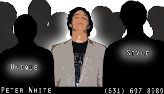
So the first one I did was kinda over-the-top, as if I were like a hip-hop producer. I recognize this isn't very professional looking, but I think it is kinda funny.
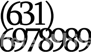
I tried experimenting with typology for a bit, which is where the other text-based cards come from. I find typology to be very beautiful, especial in a context like a business card, where there is an importance on the information that is contained.

The final one was a idea that was good in theory, a business card for a programmer, that looks like a program, but kinda weak in execution. Whatever, one day I'll implement a much stronger version.


3 - ylan: NG shirts


These shirts are part of a "Nice Guy" series sold by Wong Fu Productions (http://www.areyouaniceguy.com/). The series is inspired by a short film they made, but anyway I wanted to share them because I like how they incorporate the words into a picture and how they did that successfully with both "guy" and "girl." I'm also impressed they came up with so many ideas (more on the website), trying to combine both style and a positive message.
2 - ylan: business card

The idea comes from my recent experience living in a Buddhist Zen monastery where the monks and nuns do daily work and find plenty of “success” in their lives despite not having phones, computers, homes, or even careers and they make sure to keep networking and business to a minimum. In trying to associate my identity with a “business”, I decided to play with the use of a phone number and an address and instead incorporated popular zen sayings. I imagine that having such a card in my wallet would be a good reminder of what’s most important in the way I want to conduct both my daily business and nonbusiness.
colorblind- Hannah PP
 This is a print from a t-shirt on threadless.com. I was initially drawn to the shirt because of the colors...and that is primarily what I like about it. But I also like the contrast between the splashy, drippy relatively modern looking colors and the black and white image of a 1950s woman. I think this shirt is eye-catching and though provoking without being too hectic.
1 - ylan: what is art?

 Sorry I'm a little late on this entry... I missed the first few classes. I've read somewhere that there is no such thing as Art (especially with a capital A), only artists. I think this is an appropriate idea, especially since art exists in almost limitless forms even a single artist will often use many different media. And I guess it's also true that everyone is an artist in some way or another.
The best way I can think to define art is that it is always a symbolic representation of something. Art cannot be reality itself but it is obviously intended to communicate the artist’s ideal or perception of reality. Art is also foremost creative in the sense that it reflects the imagination and skill (in either design or manufacture) of an artist. I chose the Egyptian painting here because some of my previous conceptions of art have been challenged in an art history class I'm also taking, especially as I consider older popular manifestations of "art." The Egyptian style of painting obviously seems like it should be considered an art, but artists were despised by polite society because they worked with their hands and artists were trained to paint only in a very specific, formulaic way. Additionally, the art was not valued intrinsically but served purely superstitious/religious purposes, and the style remained identical for thousands of years. Who's "expression" is it therefore?
2-Kia Mosenthal-T-shirt

I really like how the artist of this T-shirt used the entire shirt as a canvas. The hair design continues onto the back of the shirt. I like how the lines that make up the hair are very fluid, which keeps your eye moving along. The simplicity of the color scheme is also very appealing. I think that this T-shirt is very eye-catching and does a great job at utilizing space.
3-Nicole T-Shirt design

This T-shirt is simple but really creative in being self-aware that a T-shirt is worn by people. Mimicking the layout of a product packaging is really witty because the end effect of a T-shirt is similar to packaging.
The message it sends to the viewer is mostly humor, more than a clear message about the wearer's hobbies or interests,
However, it would be a great, personalized gift for someone who actually was an organ donor.
2- Shannon: business card

This business card, that appears simple, was one of many that I designed while figuring out Photoshop for the first time. I decided to share this card with the class, altough it sounds more like an advertisement than a business card... But I felt it represents me the best, and encompasses things I love. The goofy looking stick runners that have "sun heads" are the first thing you might notice. Like the card states, I am a runner. I am also one of three athletic children, and my nickname growing up was Sunshine. I am very much interested in the sun, nature and the environment, which is why I am concentrating in Geology. However, the nickname played no part in my love for nature. That came from growing up in the country side of Illinois. And naturally, moving into a city was a change! And a city far from home, nonetheless. But this is an adventure I take with stride; just like the stick runners. There are endless possibilities and adventtures in this world; the sky really is the limit.


3 - Sri - Memorable T-shirt

As someone who scarcely buys "worded" (or other) t-shirts unless they come free to me, I racked through my closet and finally found a t-shirt I actually purchased. This t-shirt actually became publicised through the Threadless website and was created by Oliver Moss. What comprises the image includes plot-twists/endings from famous movies (such as The Matrix, Star Wars, etc.). Can we say schadenfreude? There's something comical about ruining the surprise for everyone else...but it also remarks on how omnipresent some of these movies are in our pop culture...there are few people who don't know the punchlines the t-shirt reveals. This also seems to be an engaging t-shirt for people who like to read t-shirts (myself included).

2- Tanya Khan
 This is one of those t-shirt designs that has become iconic (kind of like the mona lisa of t-shirts). It started off as part of a marketing campaign for New York State by the State Department of Commerce in 1977, and I'd say it was met with success. The thing that I found fascinating about this shirt is how it conveys a lot of different messages given one's context. Just as a Red Sox jersey screams Bostonian pride, New Yorkers probably wear the shirt as a symbol of where they are from. Tourists can buy these shirts for $10 as souvenirs of their travels while Parisian boutiques sell the trendy pop art design for five times as much. It's the same shirt but very different messages.
Wednesday, January 28, 2009
3 - Ryan Kaplan - internet shirt
 This shirt reminds me of a painting by De Chirico, 'The Elephant Celebes*'. I found it interesting because the primary function of most shirt-designs is to identify an attribute of the wearer. Witticisms identify the wearer as funny; product-designs identify the wearer as a target consumer, etc... So most shirts, it seems, are displayed for people around the wearer. As primarily aesthetic, this shirt gives pleasure directly to both the wearer and those around him/her.
*http://www.tate.org.uk/collection/T/T01/T01988_8.jpg


2 - Charlie Frohman: Hungry Hungry Hippo

This shirt was produced by BustedTees several years back, and it remains one of my favorite tshirts. I think the image and the quote (both of which appear on the center of the front side of the shirt) are absolutely hysterical. In addition, however, I really like the overall design and color scheme. Even though the image is actually quite simple, it's nonetheless quite eye-catching and definitely gets the message across. The shirt I have is slate gray, and the salmony-orange color of the hippo really stands out against the background. I'm not sure what font this is, but the bold black letters definitely catch your attention.


2 - Emily Lau -The Downside of Genetic Engineering: Blast from the Past?


First off, what struck me most about this t-shirt design that I got off of threadless.com is that the girl featured on the website wearing the shirt is the little sister of my friend from high school who I have not seen in almost four years. Weird! Nonetheless, what I like about this shirt is that it tells a story in a very unconventional way. The name of this shirt is "The Downside of Genetic Engineering." Somehow, the somewhat childlike quality to the images and the personification of the figures (the two watermelons and banana) brings to the light this very troubling and relevant issue of genetic engineering in a creative and unconventional way. I would never have thought to pair these images together in order to evoke this message, but I think that it is well done. I also love the simplicity and boldness of the whole design: from the images (very clear strokes) to the colors (yellow, green, red, black). Overall, I think this shirt is fun, thought provoking, and bold.

1-Lillie Cohn-The North West

I'm from Seattle, and being part of the Great Pacific Northwest is something that most people from the region are really proud of. People from the Northwest are known for loving the outdoors and wearing a lot of North Face gear. A kid from my high school designed this shirt a couple years ago, and the idea blew up bigtime. People everywhere, all over the Northwest, are wearing this shirt now. It's cool because it mimics the North Face logo, but also incorporates some of the region's Native American heritage. I like the simplicity of the design and the creativity of the idea on this shirt.
Tuesday, January 27, 2009

patrick rooney art
I think art is not just a picasso or a monet. I think a lot of fashion is some of the most provacative art available. I think the colors and designs in graffiti, in nike air force ones, and in thousands of clothing companies. Although some forms may be harder or more skillful or talented, I think it is just as much an art to catch the eye of a subject, not just something that is viewed in awe upon study and criticism. I think sometimes the most simple pieces stand out the most and are the most unique, which is what art is to me.
1 - Sara Coomes - What is Art?
I can't really come up with a good definition for art either. I think everyone's definition is different. It just depends on who's looking at what, or who made what. Art does something for you (or for someone else). It evokes. Most mornings the sidewalk doesn't do anything for me, but when a little kid talks a piece of chalk to it one day...maybe it does, and I think that's art. I don't think art needs to have an audience to be art, it can just be an artist expressing themselves. My picture is art in a more classic sense. I like this image because it moves and I can feel the wind in the picture.
1 -- Jamilya Ramos-Chapman -- Beyond Expression
I find art to be very difficult to define, as it there is a lot of ambiguity as to what qualifies as art. There is the artist's intention to consider and the viewer's thoughts to consider as well. Art is, probably most commonly, described as a form of expression. Art is a way to visually express a thought or perhaps feelings, and perhaps to provoke thought and feeling from others. But what qualifies a piece as art? And what would make art good or beautiful?
I have a lot of difficulty defining art, considering not only the controversy surrounding its definition, but also the desire of not wanting to limit it with a definition. All I can say, currently, is that art is very relative, as many other ambiguous topics in society. Every person as a personal definition and I cannot think of way to take the idea of art and put it into such a way that would allow us to easily qualify anything as art. As I discuss and learn more about art, perhaps I will be able to create my own definition of art, but as it stands now I am at a loss.
Does a piece have to make a statement to qualify as art? Does it have to actually provoke thought and feeling? Are aesthetics enough to qualify something as art?
I have a lot of difficulty defining art, considering not only the controversy surrounding its definition, but also the desire of not wanting to limit it with a definition. All I can say, currently, is that art is very relative, as many other ambiguous topics in society. Every person as a personal definition and I cannot think of way to take the idea of art and put it into such a way that would allow us to easily qualify anything as art. As I discuss and learn more about art, perhaps I will be able to create my own definition of art, but as it stands now I am at a loss.

Does a piece have to make a statement to qualify as art? Does it have to actually provoke thought and feeling? Are aesthetics enough to qualify something as art?
1 – Nadia Leonard: What is Art?
Art has no definitive meaning. It is ever changing and evolving with the people who create it. Still, all art does have one commonality: it is the product of human creativity. This is not to say that every piece that stems from the human imagination must be praised as a success. Art can most certainly be both good and bad, and many factors, such as use of color and composition, can contribute to a work’s artistic achievement. However, just because a piece may not be aesthetically pleasing does not mean it is undeserving of the title art. Even a bad piece possesses the ability to provoke thought or emotion in the viewer. Perhaps this is how art should be defined: a product of human creativity that evokes feeling in the viewer. If so, art is something unique to every person.
1 - Pete White: The Treachery of Images by Magritte

Trying to describe art can be quite a daunting task, as so many things that are obviously different all fall into this same category. I attempted, for a while, to describe art by what it is not. If I could define the set of all things that are not art, I would know what falls into the set of things that are art, because I certainly know there is a set of all things. This venture was ultimately a failure because I found many things could go both ways. It seems like art is more about what went on before the actual construction of the piece. In order for the fruit of someone's labor to be art, the artist has to believe what he is making is art, not just making something that he believes will be perceived as art(he, she, it, whatever). It sort of reminded me of a paradox I once heard:
"A man tells you he will give you one million dollars if you intend on killing yourself by the end of the day. You do not need to actually kill yourself, but rather as soon as you have the intention to kill yourself, you will have earned your reward. Can one truly intend to do something, if they know that all they need to do in order to achieve the desired effect, is to intend to do something?"
With that thought, I figured that the "art"ness of anything could only be determined inside the singularity of the artist's mind. But that is not the end of the story, for then all discussions of art would be trivial and inconclusive, and any criteria to appreciate or scrutinize art would be arbitrary and unfounded. There exists another side of art, the effect it produces, the inspiration it serves as, the emotions it evokes. There is something unique about human perception, something that hides beyond comprehension, that somehow generates emotional responses to pieces of art. These rules are written in a forgotten language, stored in a forgotten library. It is in this place that signals from our sensory organs are translated into feelings. Again there is a singularity, where all our rules and reasons break down, right when that which existed in the physical world, suddenly existed also in the mental world. When we try to dissect a painting, breaking it down into quantized sections of visual space and describing them by the colors that compose them, we find no art. When we record a song, and chart the frequency of each song, graphing it with respect to time, we find no art. This thing that we so desperately seek, the definition of art, is never in front of us, it is somewhere behind our eyes, and between our ears.
01 Diane Cai: An Attempt
 Defining a standard for art has been something that I've struggled with a lot for a good portion of my young adulthood. It's this intangible, fleeting thing that some people would be willing to die for-- or at the very least, live uncomfortably for. It is an ideal. It is a purpose. It is a crusade. It is not a pipe.
It steals across history in varying and alternating masks, strumming something in each individual who makes contact with it, whispering in the ear of its beholder reflections of his own nature and nurture. It is a rainbowed symphony arcing across the heavens of our personal gods. It is as we will make of it.
But at the same time it sets itself apart from other ideals. Liberty. Privacy. It is at once all of those things, and different from all of those things.
Perhaps because it is selfish. People don't typically die to protect other people's rights to art. You won't hear a starving artist exclaim, "I might not like what you paint, but I'll defend to the death your right to paint it."
And yet, it still has a genuineness about it. It is rigorous and immaculate in its intentions. It is naked, candid, and ironically artless. It is an artist's expression, and though we may be privileged enough to view it as humble and unsuspecting audience members (and if we're lucky enough, touched by it and rocked by it), we must remember that for the most part, these pieces of artwork have not been crafted for the viewing of our individual eyes. Picasso would not give two shakes of a monkey's ass if I, Diane Cai, had never seen a single one of his paintings and consequently been heart-twanged. It is easy to forget, walking into a museum or a show with our impressive Google-guided knowledge bases and presumptions, that real art is great because its creator has made it so, and less because we have decided it to be so.
So when I look at art, I look for all the usual things: aesthetic beauty (although I still make a distinction between that, and art... but that is for another post), context, meaning as I feebly try to understand it. But above all else, I look for sincerity.
Still, I won't pretend to have made much progress in this venture for a textbook definition that satisfies me; as of now, I still feel completely and totally, helplessly, hopelessly uncomfortable answering the question "what is art."
1- Tanya Khan- With Hidden Noise by Duchamp

As previously discussed in other posts, I believe that art involves two key actors, the artist or creator and the audience. Art lies at the interphase of these two players, who may very well be one in the same. The artist appeals to the senses (whether auditory, visual, tactile etc..) of the audience who takes in the piece of art using their own subjective mode of perception. Often art is used to describe a creative skill that can be evaluated on a technical basis like ballet or realism in painting. Personally, I enjoy learning about the context of pieces of art that provoke us to question what the artist is trying to convey.
Marcel Duchamp's "With Hidden Noise," as pictured above, is constructed of two copper plates sandwiching a ball of twine secured with four metal bolts. There is an unseen and unknown object enclosed within the twine. Even Duchamp did not know what the mystery item is as he had a friend place it in the space who did not once reveal its identity. I like the interactive nature of this piece (you can shake it to produce a rattling sound) and the sense of mystery that it evokes.
Here is a fun website about Marcel Duchamp and the procession of his art:
www.understandingduchamp.com
Subscribe to:
Posts (Atom)